

Most people can define digital writing.
Fewer can recognize it.
Digital writing is any writing created for screens that uses structure, links, media, or interaction to guide readers online. Unlike traditional print writing, it’s built for scrolling, clicking, and taking action.
That’s where confusion starts.
Beginners often think digital writing just means “writing on a computer.” It doesn’t. A Word document isn’t digital writing in the real sense. A blog post with headings, links, and a call to action is.
In this guide, you’ll see 10 real digital writing examples. Not theory. Not definitions repeated in different ways.
For each one, I’ll break down:
- What it is
- Where you see it
- Why it qualifies as digital writing
- What makes it work
By the end, you won’t just understand digital writing.
You’ll start spotting it everywhere.
10 Real Digital Writing Examples (Quick Summary)
Digital writing examples include content created for screens and structured for interaction, scanning, and action.
- Blog posts with headings, internal links, and SEO structure
- Social media posts designed for scrolling and engagement
- Email newsletters with personalization and tracking
- Landing pages focused on a single conversion goal
- Product descriptions built for purchase intent
- Online course lesson pages with multimedia support
- Wiki and knowledge base articles with linked references
- YouTube descriptions optimized for search and clicks
- Interactive quizzes and web tools with dynamic results
In short: Digital writing is structured for screens, built around user action, and enhanced with links, media, and measurable results.
This guide is part of the Writing Basics hub, where beginner digital writers learn the foundations step by step.
Table of Content
What Makes Writing “Digital”?
When I first started writing online, I thought digital writing simply meant typing instead of handwriting. That was my first mistake.
Digital writing is not about the device. It’s about the environment. It lives on screens, inside platforms, and inside systems built for movement.
The first thing that makes writing digital is non-linear structure.
In a printed book, you read from page one to the end. Online, readers jump. They click links, open tabs, scroll, and skip sections. A blog post with internal links, navigation menus, and anchor text invites readers to move in different directions.
That flexibility changes how you write. You don’t guide someone down a single road. You build multiple entry and exit points.
Second, digital writing often includes multimedia integration.
Text rarely stands alone online. It works beside images, embedded videos, screenshots, audio clips, and graphics. I learned this the hard way when I published long text-only posts that looked dense and heavy.
Once I started adding visuals and embedded media, engagement improved. Multimedia supports the message and keeps attention longer.
Third, digital content is designed for scanning.
Online readers don’t read word by word. They skim headings. They scan bullet points. They pause at bold phrases. That’s why web writing uses short paragraphs, clear subheadings, spacing, and structured formatting.
If a page looks like a wall of text, most people leave. Structure is not decoration. It’s survival.
Another core feature is that digital writing is built around user intent and action.
Every page has a purpose. Maybe it’s to educate. Maybe it’s to collect an email address. Maybe it’s to drive a sale.
Strong digital writing anticipates what the reader wants and guides them toward a next step. That might be clicking a link, watching a video, filling out a form, or reading another article.
Finally, digital writing is published and updated online.
Unlike print, it can be edited, refreshed, optimized, and improved over time. Blog posts get updated. Landing pages get tested. Product descriptions change. Digital content is dynamic, not fixed.
Put simply, digital writing is structured for movement, interaction, and action. It’s not just words on a screen. It’s writing designed for how people behave online.
This difference becomes clearer when you compare it to print in digital writing vs traditional writing.
Now let’s look at real examples.
If you need a deeper explanation first, start with what digital writing really means before exploring these examples.
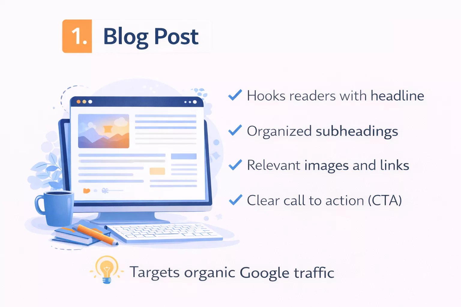
1. Blog Post Article
The blog post was the first real digital writing format I ever understood.
At the beginning, I treated it like a school essay. Long paragraphs. No subheadings. No links. Just text stacked on text. It looked fine in a Word document, but online it felt heavy and hard to read.
A proper blog post article is usually educational or informational. It answers a question, explains a process, or teaches something specific. When someone searches for a topic on Google and clicks a result, this is often what they land on.
What makes a blog post digital isn’t just that it’s online. It’s how it’s built.
First, it uses structured formatting.
You’ll see H2 and H3 headings that break ideas into sections. Paragraphs stay short, often two or three sentences. Bullet points appear when clarity matters. This structure helps readers scan before they commit to reading deeply.
I noticed this shift when I studied high-ranking SEO blog posts. None of them looked like essays. They looked organized, almost engineered for the screen.
Then there are hyperlinks.
Blog posts link to other pages. Internal links guide readers to related articles on the same website. External links reference trusted sources. These links create a web of information, not a straight line.
The first time I intentionally added internal links between related articles, time on site increased. Readers weren’t just reading one piece and leaving. They were exploring. That’s digital behavior.
Another defining feature is search optimization.
A blog post article is usually written with a target keyword in mind. The headline includes the main phrase. Subheadings support related keywords. The meta description summarizes the topic clearly. Even image alt text can play a role.
But good SEO blog writing doesn’t feel robotic. It answers real search intent. If someone searches “digital writing examples,” they want examples, not a lecture on history.
Scannable formatting also plays a huge role.
Online readers skim first. They decide in seconds if the content is worth their time. Clear headings, short paragraphs, and logical flow make that decision easier. When formatting is messy, people bounce.
Finally, most blog posts include a clear call to action.
It might invite readers to leave a comment, download a guide, join a newsletter, or read another article. That action step separates digital writing from traditional informational text. The writing doesn’t just inform. It moves the reader somewhere.
When you combine hyperlinks, search optimization, and structured formatting, you get something very different from a printed article.
You get a system designed for visibility, navigation, and action.
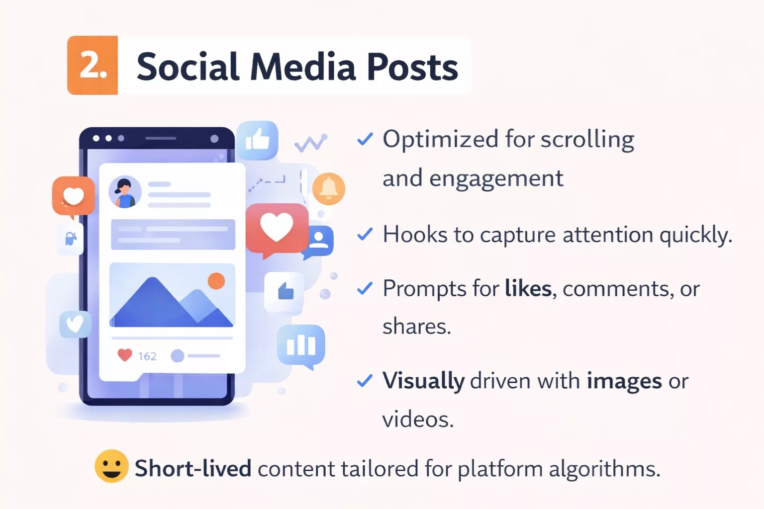
2. Social Media Post
Social media posts forced me to unlearn almost everything I thought I knew about writing.
The first time I tried to repurpose a blog paragraph into a social media caption, it flopped. Too long. Too slow. No hook. People scrolled right past it.
A social media post is short-form platform content. It lives inside apps like Instagram, LinkedIn, or Facebook. Unlike a blog post, it competes with hundreds of other pieces of content in a fast-moving feed.
What makes it digital is how tightly it’s shaped around the platform.
First, it needs a hook-driven opening.
On social platforms, the first line is everything. If the opening sentence doesn’t create curiosity or tension, the reader keeps scrolling. I learned to treat that first line like a headline. Sometimes it’s a bold claim. Sometimes it’s a question. Sometimes it names a common mistake.
Without a hook, even good advice gets ignored.
Second, social media writing is usually paired with a visual element.
An image, short video, carousel, or graphic supports the message. The text and visual work together. The words might spark interest, but the visual stops the scroll. That combination is something traditional writing rarely deals with.
Another key feature is platform-native writing.
Each platform has its own rhythm. A LinkedIn post might be slightly longer and story-driven. An Instagram caption might be tighter and more emotional. A Facebook post might encourage discussion.
When I first cross-posted the exact same message everywhere, engagement dropped. The structure has to match the environment.
Social media content is also built for interaction.
Likes, comments, shares, saves. These aren’t passive metrics. They are part of how the writing spreads. Strong digital writing on social platforms often includes engagement prompts. A simple “What do you think?” or “Have you experienced this?” invites participation.
That interaction changes the role of the writer. You’re not just publishing. You’re starting a conversation.
Finally, there’s the algorithm-driven structure.
Social platforms prioritize content that keeps people engaged. That means short paragraphs. Line breaks. Easy-to-read sentences. Often, one sentence per line. This formatting increases dwell time and readability inside a mobile app.
It’s not random styling. It’s strategic.
A social media post may look simple. But behind that simplicity is structure designed for scrolling behavior, engagement signals, and platform mechanics.
That’s what makes it real digital writing.
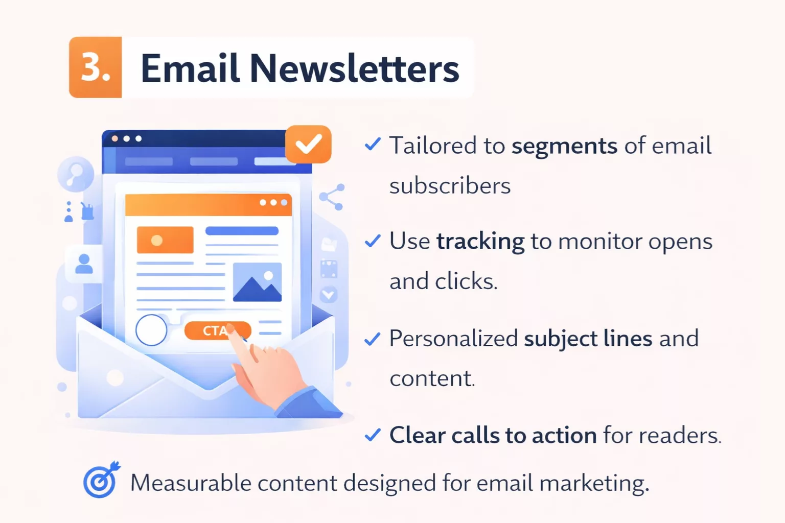
3. Email Newsletter
Email newsletters taught me something I didn’t expect.
Writing for one person feels harder than writing for the internet.
An email newsletter is direct-to-inbox communication. It doesn’t live on a public feed like social media. It lands in someone’s private space, right between work updates and personal messages. That changes the tone immediately.
When I first started sending newsletters, I wrote them like mini blog posts. Structured. Formal. Slightly distant. Open rates were fine, but replies were almost zero.
Everything shifted when I made the tone more conversational.
Email writing works best when it feels like a one-to-one message. Simple language. Short paragraphs. Natural flow. Sometimes even admitting small mistakes or lessons learned. That human tone builds trust in a way polished corporate copy rarely does.
Another defining feature of digital writing in email is personalization.
Most email platforms allow you to insert the subscriber’s first name or tailor content based on behavior. Seeing your name in the greeting might seem small, but it increases connection. More importantly, content can change based on what someone clicked before.
That leads to one of the most powerful digital elements: segmentation.
Not every subscriber wants the same thing. Some may be beginners. Others may be further along. Good newsletters divide audiences into segments based on interests, past actions, or signup sources. The writing adapts to each group.
This isn’t possible in traditional print. It’s built into digital systems.
Email newsletters also rely heavily on click tracking.
Every link inside the message can be measured. You can see who clicked, what they clicked, and how often. That feedback loop changes how you write. Over time, patterns appear. Certain subject lines perform better. Certain call-to-action placements get more clicks.
Digital writing evolves because data shows what works.
Formatting also matters, especially on mobile.
Most emails are opened on phones. That means short paragraphs, clear spacing, and obvious buttons. Long blocks of text feel overwhelming on small screens. I learned quickly that if it looks dense on mobile preview, it will likely be ignored.
Finally, strong newsletters focus on a single, clear call to action.
One main link. One next step. Whether it’s reading a blog post, watching a video, or downloading a guide, the goal stays focused. Too many links dilute attention.
An email newsletter may look simple in the inbox. But behind it sits segmentation systems, tracking tools, and mobile-first formatting.
That’s digital writing in action.
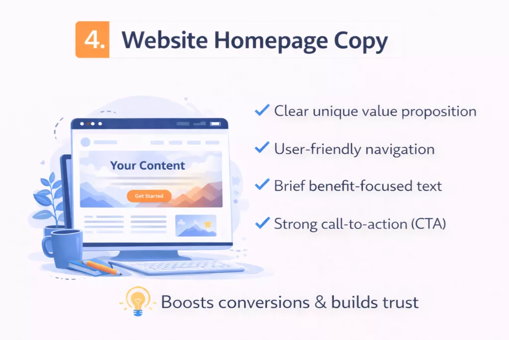
4. Website Homepage Copy
Homepage copy humbled me fast.
I used to think the homepage was just an introduction. A welcome message. A few paragraphs about what the site does. That approach did nothing.
A website homepage is first impression messaging. It answers one silent question in seconds: “Am I in the right place?”
When someone lands on a homepage, they don’t read everything. They scan the top section. They look for clarity. If they feel confused, they leave.
That’s why the value proposition sits front and center.
The headline should state who the site is for and what problem it solves. Not clever wordplay. Not vague inspiration. Clear positioning. When I rewrote a homepage headline from something abstract to something specific, bounce rate dropped almost instantly.
Under that headline, the structure begins to guide the eye.
This is where UX-driven structure comes in. UX means user experience. Homepage copy isn’t just about words. It’s about layout, spacing, buttons, and flow. The writing works inside a visual hierarchy.
The most important message appears at the top. Supporting details follow. Deeper explanations come later. That layered structure respects how people scroll.
Navigation guidance also matters.
Menus, buttons, and section links tell visitors where to go next. “Start here.” “View services.” “Read the blog.” These small phrases are digital writing too. They’re microcopy, and they guide behavior.
I once ignored navigation text and focused only on the main body copy. That was a mistake. Clear navigation reduces friction and increases time on site.
Another critical element is trust signals.
Testimonials. Logos. Years of experience. Case studies. Even simple statistics. These aren’t random additions. They reduce doubt. In digital environments, trust must be built quickly because competitors are one click away.
The homepage also follows a clear hierarchy of information.
Headline. Subheadline. Benefits. Proof. Call to action. Each section supports the next. If the order feels random, readers struggle to process it. Strong hierarchy makes complex information feel simple.
And unlike a blog post, homepage copy is heavily conversion-oriented.
The goal is not just to inform. It’s to move the visitor toward a next step. That might be booking a call, signing up for a newsletter, or exploring a service page. Every section supports that outcome.
Website homepage copy is digital because it combines structure, navigation, psychology, and action in one place.
It’s not just an introduction.
It’s a decision point.
5. Landing Page
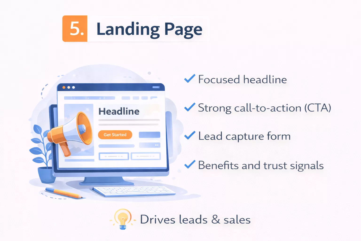
Landing pages changed how I think about focus.
The first one I built looked like a homepage. Navigation bar at the top. Multiple links. Too many options. It felt complete, but it converted poorly.
A true landing page is a single goal page.
One offer. One outcome. One primary action. That’s it. If the goal is to collect email signups, everything on that page supports that one action. If the goal is to sell a course, every section moves toward that purchase decision.
The persuasive headline sits at the top and does heavy lifting.
It speaks directly to a problem or desired result. Not vague branding. Not clever slogans. Clear benefit. I learned that when headlines focused on outcomes instead of features, conversion rates improved.
Right under the headline, strong landing pages follow a problem-solution structure.
They name the frustration. They show the cost of staying stuck. Then they present the offer as the solution. This flow taps into conversion psychology. People act when they feel understood and see a clear path forward.
Testimonials usually appear after the main promise.
These are not filler quotes. They reduce risk. When visitors see proof from others who achieved results, resistance lowers. Social proof plays a big role in digital decision-making because online trust must be earned quickly.
Another defining feature is the presence of strong CTA buttons.
Clear text. Clear color contrast. Direct language like “Get Access” or “Start Now.” The button isn’t hidden at the bottom. It appears multiple times throughout the scroll.
That brings us to scroll flow.
Landing pages are designed vertically. Each section builds on the last. Headline. Problem. Solution. Benefits. Proof. FAQ. Call to action. This structure isn’t random. It guides attention in a controlled sequence.
When sections feel disorganized, visitors get confused. Confused people don’t convert.
Good landing pages also use minimal distraction design.
No top navigation menu. No unrelated links. Limited exit points. Every unnecessary option reduces focus. I once removed the main site navigation from a landing page and conversions increased. Less choice led to more action.
Everything about a landing page is built around conversion orientation.
The writing is tighter. The structure is intentional. The flow anticipates objections. Even spacing and button placement are strategic.
A landing page is digital writing at its most focused.
It doesn’t aim to inform broadly.
It aims to move one decision forward.
6. Product Description Page
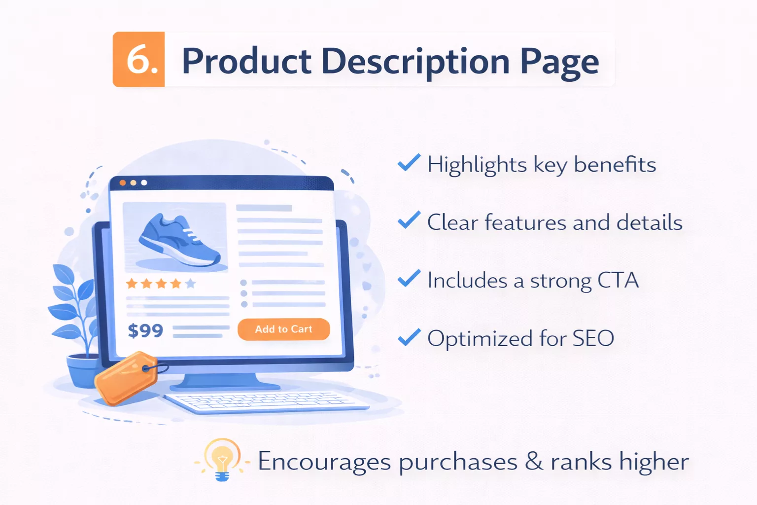
Product description pages taught me how different buying behavior is from browsing behavior.
When someone lands on a product page, they are not casually exploring. Most of the time, they already have purchase intent. They’re comparing options. Looking for reassurance. Checking details.
Early on, I made the mistake of writing product descriptions like technical summaries. Features stacked in paragraphs. Specifications listed without context. It looked complete, but it didn’t persuade.
A strong product description page starts with benefits-first copy.
Instead of leading with technical details, it answers one simple question: “What will this do for me?” If it’s a software tool, the benefit might be saving time. If it’s a physical product, the benefit might be durability or comfort. Features support the benefit, not the other way around.
This shift from features to benefits is central to purchase intent writing.
When someone is close to buying, they don’t want theory. They want clarity and confidence. The writing should reduce doubt and reinforce the value of the decision.
Structured formatting plays a major role here.
Product pages rely heavily on bullet points. Short benefit statements. Clear feature highlights. Easy-to-scan sections like “What’s Included” or “Key Specifications.” Long paragraphs slow buyers down. Bullet points speed decision-making.
I noticed this when analyzing high-converting ecommerce pages. They rarely bury key information in dense text. They surface it quickly.
SEO keywords are also important.
Product description pages are often optimized around specific search terms. Model names. Product categories. Problem-based keywords. But the optimization must feel natural. Keyword stuffing damages readability and trust.
When done well, SEO helps the page appear in search results for high-intent queries. That’s powerful because the traffic arriving is already primed to evaluate and possibly purchase.
Another defining feature of digital product pages is embedded reviews.
User-generated reviews, star ratings, and testimonials add credibility. These aren’t just social proof elements. They are part of the writing ecosystem on the page. Buyers often scroll directly to reviews before reading the main description.
That behavior shapes how product pages are structured.
Everything is built for skimmability.
Clear headings. Short paragraphs. Visual separation between sections. Pricing and buttons placed near key benefits. Buyers scan, pause, evaluate, and then act.
A product description page is digital writing because it blends persuasion, formatting, SEO structure, and user behavior into one focused environment.
It’s not about telling a story.
It’s about helping someone feel confident enough to click “Buy.”
7. Online Course Lesson Page
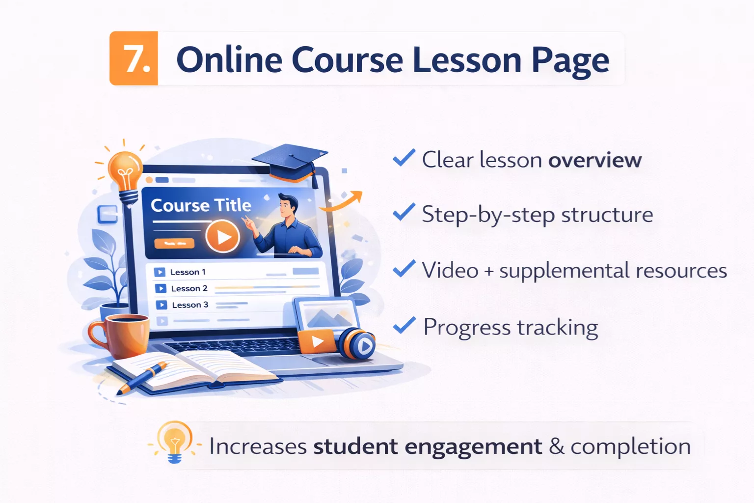
Online course lesson pages showed me how digital writing supports learning, not just marketing.
The first time I created a lesson page, I assumed the video did all the work. I uploaded the recording, added a short paragraph underneath, and moved on. Students got confused.
That’s when I realized the written layer matters just as much as the video.
An online course lesson page usually combines written instructions and video. The video explains the concept. The written section reinforces key points, outlines steps, and highlights important details. This is multimedia layering in action.
Text supports video. Video supports text. Together, they create clarity.
Many lesson pages also include downloadable resources.
Worksheets. Checklists. Templates. Slides. These resources are introduced and explained through digital writing. Clear instructions tell students how to use them and when to apply them. Without that guidance, downloads often go unused.
Structure becomes critical here.
A strong lesson page follows a step-by-step flow. It doesn’t dump information randomly. It moves from concept to demonstration to action. Headings guide the learner. Bullet points summarize key takeaways. Important terms may be highlighted.
This structured learning path helps reduce overwhelm.
When I reorganized lesson pages into clearer sequences, completion rates improved. Students moved through content more confidently because they could see where they were and what came next.
That brings up another defining feature: progress indicators.
Many course platforms show completion checkmarks, progress bars, or module tracking. These visual signals are part of the digital environment. They motivate learners to continue. The writing inside the lesson often references this progression.
For example, a lesson might begin with a short overview and end with a reminder to complete the next module. That sense of direction reinforces momentum.
Instructional clarity is the foundation of course writing.
Sentences need to be simple. Steps need to be explicit. Assumptions need to be minimized. If learners must guess what to do next, frustration builds quickly. Clear digital writing reduces cognitive load.
An online course lesson page is digital because it blends structure, media, and guided action into a single experience.
It’s not just content delivery.
It’s a designed learning journey.
8. Wiki or Knowledge Base Article

Wiki-style writing changed how I think about control.
In most content formats, one author shapes the message. A wiki or knowledge base article feels different. It’s structured, interconnected, and often built to evolve over time.
The first time I explored a large knowledge base, I noticed something right away. I wasn’t reading from top to bottom. I was jumping.
A wiki or knowledge base article relies heavily on linked references.
Important terms are clickable. Related topics are linked within the text. Instead of forcing readers through a fixed order, the structure invites exploration. One link leads to another. That web of connections is the foundation of hypertext structure.
This is where digital writing becomes clearly non-linear.
You might land on one article, skim a definition, click into a related concept, then branch into a deeper explanation. Each page stands alone, but it also connects to a larger system. Traditional print rarely allows this level of fluid movement.
Cross-navigation plays a major role.
Sidebars often list related articles. Breadcrumb trails show where you are inside the system. Categories group similar topics together. These elements guide readers without forcing a rigid sequence.
When I began building small knowledge bases for internal projects, I realized how important organized sections are. Clear headings. Logical subsections. Defined terminology. Without structure, information becomes overwhelming fast.
Another defining feature is the editable structure.
Many wiki-style platforms allow updates and revisions. Content can be improved, corrected, or expanded over time. That flexibility makes digital knowledge dynamic. It isn’t locked in place the way printed reference books are.
This leads to collaborative editing in many cases.
Multiple contributors may add information, refine explanations, or update outdated material. That collaborative element shapes tone and consistency. Writing must be clear enough that others can build on it.
Because readers often arrive through search, skimmability matters here too.
Definitions appear near the top. Key facts are highlighted. Sections are organized for quick access. Readers often scan for a specific answer rather than reading the entire article.
A wiki or knowledge base article is digital writing because it embraces hypertext structure, non-linear reading, and shared authorship.
It’s not a single voice telling a story.
It’s a network of information designed to be explored.
9. YouTube Video Description
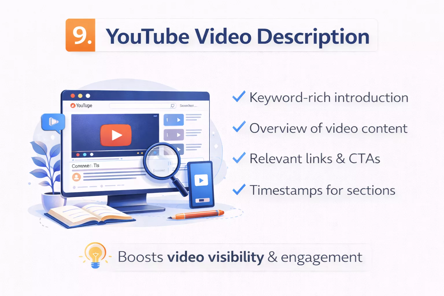
I used to ignore video descriptions.
I’d upload a video, write two quick sentences, drop a link, and move on. Big mistake.
A strong YouTube video description is digital writing that supports visibility, structure, and action. It may sit below the video, but it plays a major role in how the content performs.
First, it often includes SEO keywords in the first lines.
Search engines and the platform itself scan those opening lines to understand what the video is about. The primary keyword usually appears naturally in the first sentence or two. This helps the video rank for relevant search queries.
When I started writing descriptions with search intent in mind instead of random summaries, discoverability improved.
Timestamps are another important feature.
You’ll often see time markers like:
0:00 Introduction
2:15 Main concept
6:40 Step-by-step walkthrough
These timestamps improve user experience. They allow viewers to jump directly to the section they care about. That’s digital structure designed for non-linear consumption.
Links to resources also appear in most well-written descriptions.
These might include blog articles, tools mentioned in the video, related playlists, or affiliate resources. Each link extends the experience beyond the video itself. It creates a pathway.
That’s hyperlinked digital writing again.
CTA placement matters too.
Many descriptions include a call to action early in the text. It might encourage viewers to subscribe, download a guide, or watch another video. Placement is strategic. If the CTA is buried at the bottom, fewer people see it.
Formatting plays a subtle but important role.
Good descriptions use spacing. Short paragraphs. Clear separation between sections. Walls of text reduce readability. Clean formatting increases the chance that someone will actually scroll and engage.
Unlike a traditional caption in print, a video description interacts with algorithms, search indexing, and clickable pathways.
It supports the main content while standing on its own.
That makes it another clear example of digital writing in action.
10. Interactive Web Tool or Quiz
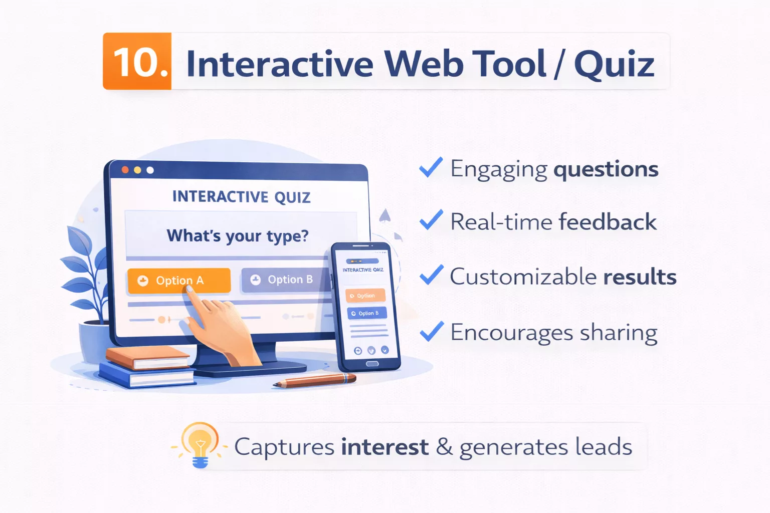
Interactive tools taught me that sometimes the smallest pieces of writing matter most.
Not long paragraphs. Not big explanations. Just short instructions. Button labels. Tiny prompts.
An interactive web tool or quiz relies heavily on instructional microcopy.
Microcopy is the short text that guides users inside forms, calculators, quizzes, and dashboards. It tells you what to enter. It explains what happens next. It reassures you when something goes wrong.
I once built a simple quiz without clear instructions above the first question. Completion rate was low. After adding one short sentence explaining what the quiz would do and how long it would take, engagement improved. Small words. Big impact.
These tools also use step-by-step prompts.
Instead of presenting all information at once, they guide users through a sequence. One question at a time. One action at a time. This reduces overwhelm and keeps attention focused.
That step-by-step flow is intentional. It creates momentum.
Another defining feature is dynamic results.
Once users enter data or complete a quiz, the page responds. It might generate a score, a personalized recommendation, or a calculated number. The writing that appears in the results section must feel tailored and clear.
This is where engagement-focused writing becomes critical.
The results often summarize what the input means. They may explain strengths, highlight gaps, or suggest next steps. If the result text feels generic or vague, users lose trust. When it feels specific and helpful, they’re more likely to share it or act on it.
Interactive tools also rely on data input fields.
Each field includes labels and sometimes helper text. Clear wording reduces errors. Confusing labels increase abandonment. Digital writing here is practical and precise.
For example, a calculator might include a field labeled “Monthly Revenue (before taxes).” That extra clarification prevents mistakes. One small phrase changes user accuracy.
Unlike blog posts or emails, interactive web writing responds in real time.
It adapts. It reacts. It guides behavior as it happens.
An interactive web tool or quiz is digital writing because it combines instruction, user input, personalization, and action in one environment.
It doesn’t just deliver information.
It creates an experience shaped by the user’s choices.
Patterns You’ll Notice Across All Digital Writing Examples
After working through all these formats, I started seeing the same patterns everywhere.
At first, each example felt different. A blog post didn’t look like a landing page. A quiz didn’t feel like an email. But once you zoom out, the structure repeats.
The first clear pattern is that digital writing is structured for scanning.
Short paragraphs. Clear headings. Bullet points. Visual spacing. Online readers don’t move through content in a slow, linear way. They scan first. They decide fast. If nothing stands out, they leave.
I learned this by watching heatmap tools on webpages. Readers jump to subheadings. They pause at bold phrases. They skim lists. That behavior shapes how digital content is formatted.
Another shared trait is that digital writing is built around action.
There is almost always a next step. Click a link. Subscribe. Watch a video. Start a free trial. Even informational content often nudges readers toward something.
Traditional writing can exist just to inform. Digital writing usually exists to move.
It’s also clearly designed for devices.
Most content today is consumed on phones. That means narrow screens, thumb scrolling, and limited attention. If paragraphs are long or layouts are cluttered, the experience breaks down quickly.
When I started previewing content on mobile before publishing, I caught mistakes I never noticed on desktop.
Another consistent pattern is the inclusion of links or navigation paths.
Internal links connect articles. Buttons guide users to other pages. Menus organize content. Digital writing rarely stands alone. It sits inside a system.
That interconnected structure is part of what makes it digital rather than static.
Media integration shows up again and again.
Images. Embedded videos. Graphics. Interactive elements. Text often works alongside other formats to support understanding and engagement. Rarely is it just a block of words.
Finally, digital writing is updated and measurable.
Blog posts can be edited. Landing pages can be tested. Emails can be optimized based on open rates. Product pages can be refined. Data informs improvement.
That feedback loop doesn’t exist in traditional print the same way. Digital content evolves.
When you combine all these patterns, a clear picture forms.
Digital writing is structured for scanning. Built for action. Designed for devices. Connected through links. Enhanced by media. And refined over time through measurable results.
Once you recognize these patterns, you start seeing digital writing everywhere.
These examples become even more useful when you understand the strategy behind them. Explore our SEO writing guide to see how structure and optimization work together.
Key Takeaways
- Digital writing is designed for screens, not paper.
- It uses structured formatting like headings, short paragraphs, and bullet points.
- Hyperlinks and navigation paths allow non-linear reading.
- Most digital writing includes a clear call to action.
- Multimedia elements like images and video often support the text.
- Digital content is measurable and can be updated over time.
- Examples include blog posts, landing pages, emails, product pages, and interactive tools.
Frequently Asked Questions
What is a simple example of digital writing?
A blog post is one of the simplest examples of digital writing. It uses headings, short paragraphs, hyperlinks, and often includes images or calls to action. It is structured for online reading rather than print.
How is digital writing different from traditional writing?
Digital writing is built for screens and interaction. It includes links, navigation paths, multimedia elements, and measurable actions. Traditional writing is usually linear and designed for print without interactive features.
Is social media considered digital writing?
Yes. Social media posts are digital writing because they are structured for scrolling, engagement, and platform algorithms. They often include hooks, visuals, and prompts for likes, comments, or shares.
Are emails an example of digital writing?
Yes. Email newsletters are digital writing because they are delivered electronically, use personalization and tracking, and include clear calls to action. They are designed for mobile devices and measurable engagement.
Why are hyperlinks important in digital writing?
Hyperlinks allow readers to move between related pages. This creates a non-linear reading experience and helps guide users through content. Links are a core feature that separates digital writing from print writing.
Conclusion: Digital Writing Is Structure in Action
Digital writing is not just writing that happens online.
It’s writing shaped by structure, movement, and intent.
Across all ten examples, you probably noticed the same core elements repeating. Clear formatting. Links that guide navigation. Multimedia integration. Calls to action. Writing designed for scanning instead of slow reading. These patterns are not accidental. They reflect how people behave on screens.
A blog post uses SEO structure and hyperlinks. A landing page uses conversion psychology and scroll flow. A product page leans on skimmable formatting and reviews. A quiz uses instructional microcopy and dynamic results. Different formats, same foundation.
Digital writing is built for interaction.
It assumes the reader will click, scroll, tap, or respond. It lives inside platforms. It adapts to devices. It can be updated, measured, and improved over time. That flexibility is what separates it from traditional print writing.
If you want to improve your digital writing skills, start observing.
Open a blog post and study the headings. Look at how a landing page guides your eye. Notice how social media posts use hooks and spacing. Analyze how product descriptions surface benefits quickly. The more you break down structure, the more confident your own writing becomes.
Digital writing isn’t about being clever.
It’s about being clear, intentional, and structured for how people actually consume content today.
Now that you’ve seen real digital writing examples with breakdowns, your next step is simple.
Pick one format and practice building it with structure in mind.
If you’re ready to move from learning to doing, here’s a practical guide on how to become a digital writer as a beginner.